DIGITAL ESTATE
The Typography of Trust: Why Your Brand Looks Cheap
A high-net-worth guest lands on your website. Before they read a single word of your copy, before they view the gallery, their brain has already calculated the perceived value of your property.
This calculation happens in milliseconds, and it is largely dictated by typography.
You cannot charge $800 a night if your primary digital real estate is built on a default system font. It signals a lack of attention to detail—and if an owner neglects their website's architecture, the guest assumes they also neglect the room's cleanliness.
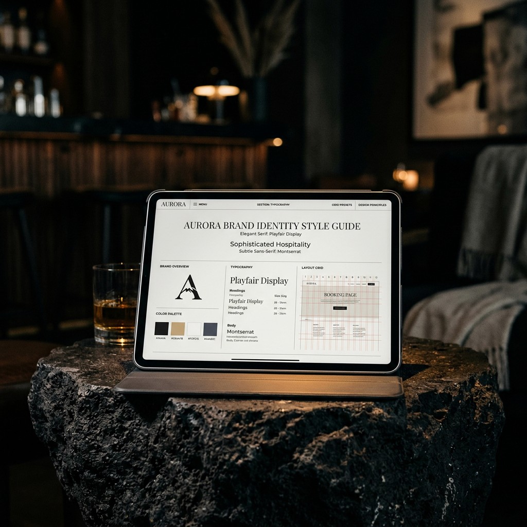
At NZENZI, we treat visual identity as commercial armor. The structural weight of a bespoke typeface—such as the bold, architectural presence of Bricolage Grotesque paired with the clinical precision of Satoshi —does not just look beautiful. It anchors the brand. It creates a psychological threshold that justifies your rate card.
The full Dossier is reserved for our private network.
Submit your corporate credentials to receive the unredacted case study.
1
2